For over a century, we’ve been told a simple story about why we see lingering colors. New research reveals the illusion is not a trick of the brain, but a fundamental feature of our eyes.
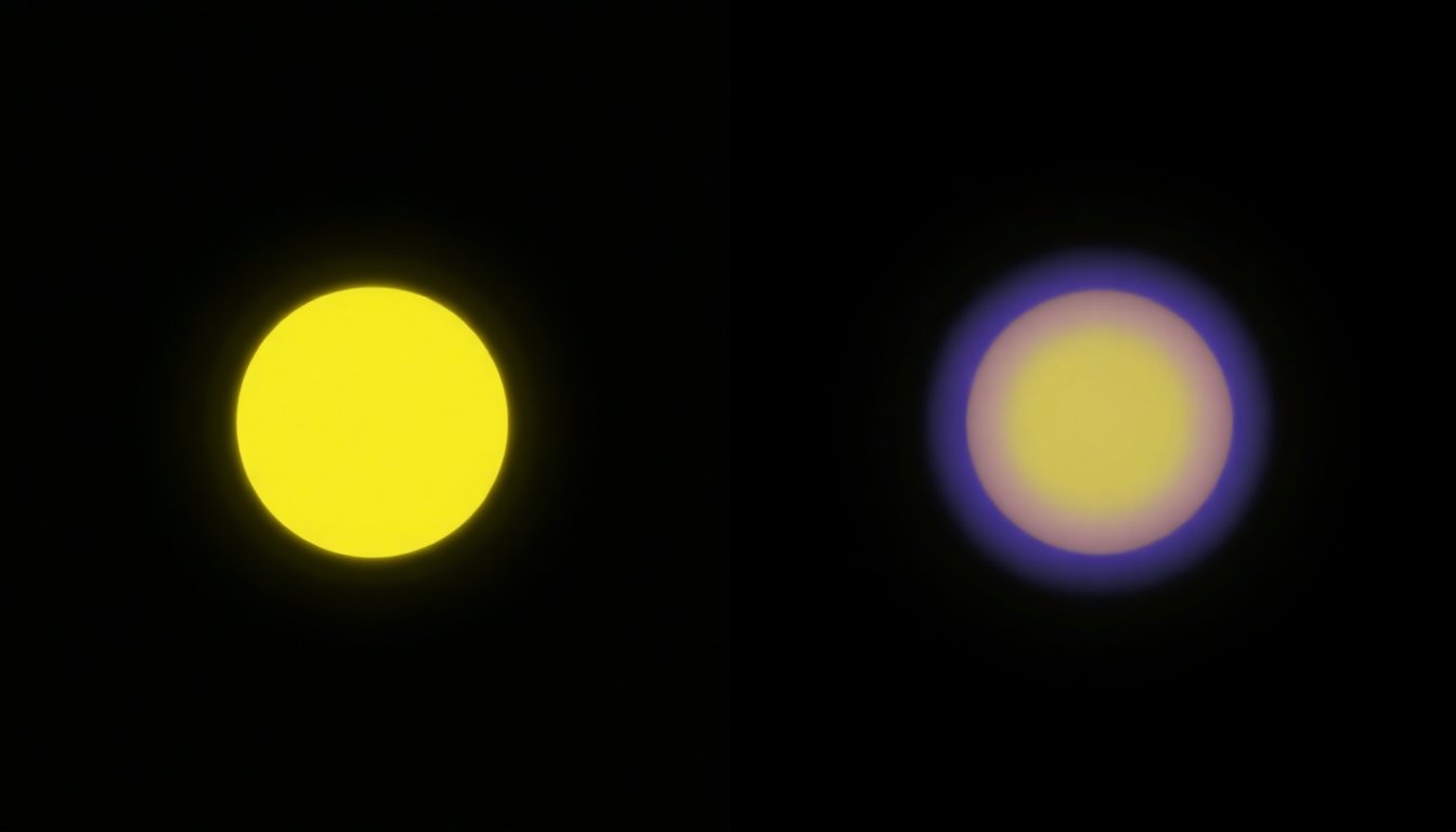
Try a classic experiment. Stare at a bright yellow circle for about 30 seconds without moving your eyes. Now, quickly look at a blank white wall. What do you see? Most people report seeing a ghostly, floating circle of a bluish-purple hue. This is a color afterimage, a fascinating illusion that has been used for decades to explain a core concept of vision: color opponency.
The traditional story, found in countless psychology and neuroscience textbooks, is that our vision system is built on opposing pairs: red versus green, and blue versus yellow. The theory goes that when you stare at yellow, the ‘yellow’ cells in your visual pathway get tired or ‘fatigued.’ When you look away, the opposing ‘blue’ cells rebound, firing strongly and creating the perception of a blue afterimage. It’s a simple, elegant explanation. But what if it’s wrong?
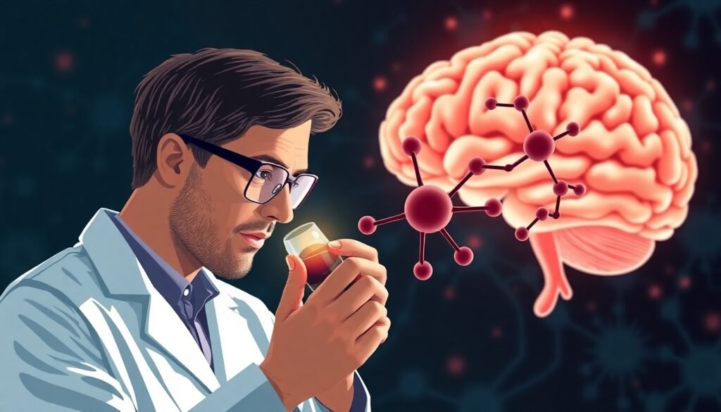
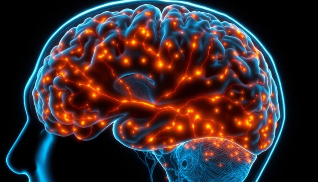
A groundbreaking study published in Communications Psychology challenges this long-held belief, suggesting the origin of afterimages is both simpler and more complex than we thought. The research indicates that the phenomenon isn’t born from opponent channels in the brain, but from the very first stage of vision: the cone cells in our retinas.
A Tale of Two Models: Brain vs. Eye
To understand the new findings, we need to compare the old model with the new one. The classical cone-opponent model suggests that after the eye’s photoreceptors capture light, the signal is processed by higher-level neurons that are organized in opponent pairs. Adaptation happens at this second stage. It’s a subtractive process: fatigue from yellow subtracts from your perception, causing a rebound of blue.
The new evidence, however, points squarely to a cone-adaptation model. This model argues that the effect happens right at the source—the three types of cone photoreceptors in the retina that are sensitive to short (S, blue), medium (M, green), and long (L, red) wavelengths of light. When you stare at a yellow light, you are primarily stimulating your L and M cones. These cones adapt and become less sensitive. When you then look at a neutral grey or white area, the unadapted, fresh S-cones respond most strongly relative to the fatigued L and M cones. The resulting signal, dominated by the S-cones, is what produces the violet-blue afterimage. This is a divisive adaptation, not a simple subtractive one, and it makes markedly different predictions about the exact colors we should see.

Putting Perception to the Test
So, how do you prove one model over the other? You can’t just ask people, "Does that look like an opponent color?" The researchers behind the study designed a series of meticulous experiments to precisely measure the hue and colorfulness (chroma) of afterimages.
In several experiments, participants were shown colored shapes, called ‘inducers,’ for a sustained period. Afterward, they had to match the color of the lingering afterimage to one of nine comparison colors. To get even more precise data and prevent the afterimage from fading, the researchers also used a clever ‘chaser-like’ paradigm. In this setup, a moving grey circle on a colored ring creates a constantly refreshed afterimage, allowing observers to carefully adjust a central patch to perfectly match the afterimage’s hue and saturation.
Across these experiments, the team tested a massive range of 72 different inducer colors, sampling the entire color spectrum. This comprehensive approach allowed them to create a detailed map of the relationship between a color and its afterimage.
The Results Are In: A Win for Cone Adaptation
The data from all experiments told a clear and consistent story. The colors of the afterimages did not align with the predictions of the cone-opponent model. The afterimage of red wasn’t a perfect cyan, and the afterimage of yellow wasn’t the pure blue that Hering’s opponent theory would suggest. Instead, the perceived hues were systematically shifted.
When the results were plotted, they didn’t form a perfect circle of opponent colors. Instead, they clustered into three distinct groups, forming a characteristic triangular shape. This is the exact signature predicted by the cone-adaptation model. The three peaks of the triangle correspond to afterimages dominated by the L, M, and S cones, respectively. The model based on cone adaptation was a stunningly accurate predictor of what people actually saw, explaining over 60% of the variance in hue and more than 80% of the variance in chroma (colorfulness).
In contrast, models based on color opponency—including the classic Hering red-green/blue-yellow pairs and the Munsell color system—were the worst predictors of the afterimage colors people experienced.
Rewriting the Textbooks
This research does more than just refine a minor detail of vision science; it fundamentally reframes our understanding of a common perceptual illusion. It demonstrates that the origin of complementary afterimages is not a high-level cognitive or neural process, but a direct consequence of the physical properties of the photoreceptors in our eyes.
While higher-level brain functions can certainly influence our perception of color, these findings show they are not the origin of the afterimage itself. The complex illusion can be fully and coherently explained by a straightforward model of cone adaptation that has been understood for decades. The reason the old story persisted is that, at a coarse level, afterimages seem opponent. A reddish color produces a greenish afterimage, and a yellowish color produces a bluish one. But ‘ish’ is the operative word. The precise, quantitative measurements revealed that the true relationship is non-opponent.
So, the next time you find yourself mesmerized by a lingering, ghostly color, remember what you’re witnessing. It’s not just a trick of the mind. It’s a direct window into the beautiful and complex dance of adaptation happening within the cone cells of your own eyes, the very first step in the incredible journey of sight.
Reference
Witzel, C. (2024). The non-opponent nature of colour afterimages. Communications Psychology, 3(1), 1-17. https://doi.org/10.1038/s44271-025-00331-5